(Left) Moe's Home Collection Raphael Yellow Sofa Couch and (Right) Caracole Classic Peacock / Golden Blonde Leaf / Warm Reflections Buffet, both from TopModern
When done well, decorating with jewel tones adds an air of luxury and opulence to any interior while infusing the space with color and texture. From deep emerald green to saturated ruby red, jewel tones have just as rich a history as they do pigment. While they have roots as old as mankind, they are also incredibly current. Featured in everything from the embroidery of royal robes a thousand years ago to the upholstery of an Italian Post-Modernist sofa, jewel tones are far more versatile and imbued with greater staying power than many might imagine. This year — in 2021 — jewel tones have emerged as a major interiors trend, finding their way into all manner of wares. Learn more about the 2021 interiors trend and how to decorate with jewel tones at home below.
Jewel tones are those inspired by the coloration of — you guessed it — naturally occurring jewels and pigments, many of which have been used throughout history as currency and to denote wealth. The most commonly recognized — and utilized — jewel tones are citrine, jade, emerald, turquoise, aquamarine, amethyst, sapphire, ruby, lapis and rose quartz. These precious stones — and their eponymous colors — boast rich histories. For instance — explains the article “What Makes Jewel Tones Special” from ArtCollective — lapis lazuli — a deep, often striated blue stone — “was mined as early as the 7th century BC in Afghanistan.” It was considered “an important element in...jewelry, sculptures and paintings...since the age of ancient civilizations like India, Egypt, Mesopotamia and China.” Similarly, jade — referred to as the “Emperor’s Stone” — “has a long history intertwined with ancient China... India, Korea, Burma, native New Zealand and Mesoamerican cultures like the Mayans.” Jade has been used for centuries in the creation of jewelry and royal accouterments but also to “make artifacts [and] ceremonial objects.”
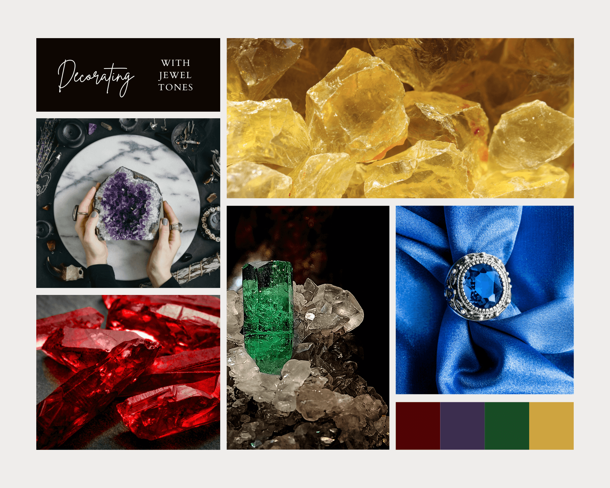
While citrine, emerald, amethyst, sapphire and ruby — nearly all derivations of primary colors — are most often referred to as jewel tones, softer tones inspired by paler jewels also qualify. In fact, colors like jade and rose quartz might be perfect for those intrigued by the jewel tones trend but anxious about applying such a shocking shade. In her article “The Jewel Tone Paint Colors We’re Loving Right Now” for Architectural Digest, Gabriela Ulloa endorses these softer tones, referring to them as the “NEW jewel tones in town.” Consider soothing shades like peridot and rose quartz for an “understated tone [that] will finish off a room without going overboard.”
Elyse Taylor explains the resurgence of interest in jewel tones — after a long spell of minimalism and neutral palettes — in her article “Interior Design Trends to Know in 2021—And What’s on Its Way Out” for Vogue. Quoting industry-topping interior designers, Taylor notes that decorating with the purpose of creating a space that is livable and expresses one’s sense of style and character is back in. Quoting English textile and interior designer Kathryn M. Ireland, Taylor writes that “‘real decorating is back in—colors, textures, a mix of old and new.” Furthermore, explains Timothy Corrigan, “‘crisp, clear colors are continuing to grow in popularity.’” Jewel tones like “‘yellows...blues/turquoises, and greens being used to brighten up spaces and put a smile on your face during these challenging times.’” Jewel tones have topped the “color trends” lists assembled in many magazines and by many designers this year, from Architectural Digest to Modish. Homeowners and decorators alike are tired of gentle hues and quiet rooms.
This year, they are looking for cozy yet loud spaces that tell their visitors who they are and what they love upon first glance, forgoing stark minimalism for maximalism and eclecticism. Lauren Wicks elaborates in her article “Top Interior Designers Predict The Biggest Color Trends for 2021” for Veranda. Quoting Marie Flanigan of Marie Flanigan Interiors, Wicks writes that “vibrance [will be] everywhere” in 2021.” Flanigan believes that throughout the year, “‘we’ll continue to see the resurgence of rich, saturated hues.” She expects stunning shades with lots of depth and shine “like ruby and sapphire, to earthy shades, like cypress and saffron” to climb to the top. Marie Flanigan anticipates that in 2021, “‘designers and homeowners won’t shy away from interiors lavishly swathed in color.”’ Also quoted by Wicks, bi coastal designer Allison Caccoma agrees with Flanigan, noting that “2021 will be all about refreshing and reinvigorating color,” infusing spaces with the “feel-good happiness” we lacked in 2020. She recommends jewel tones because they “‘create a visually stimulating home!’”
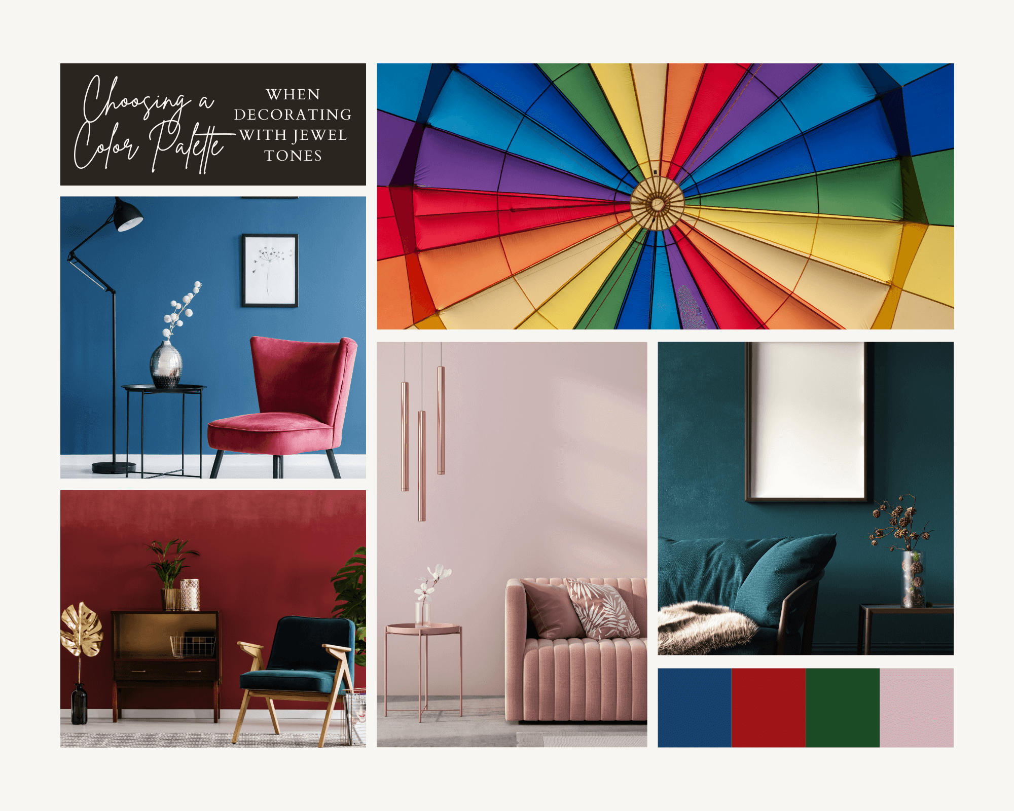
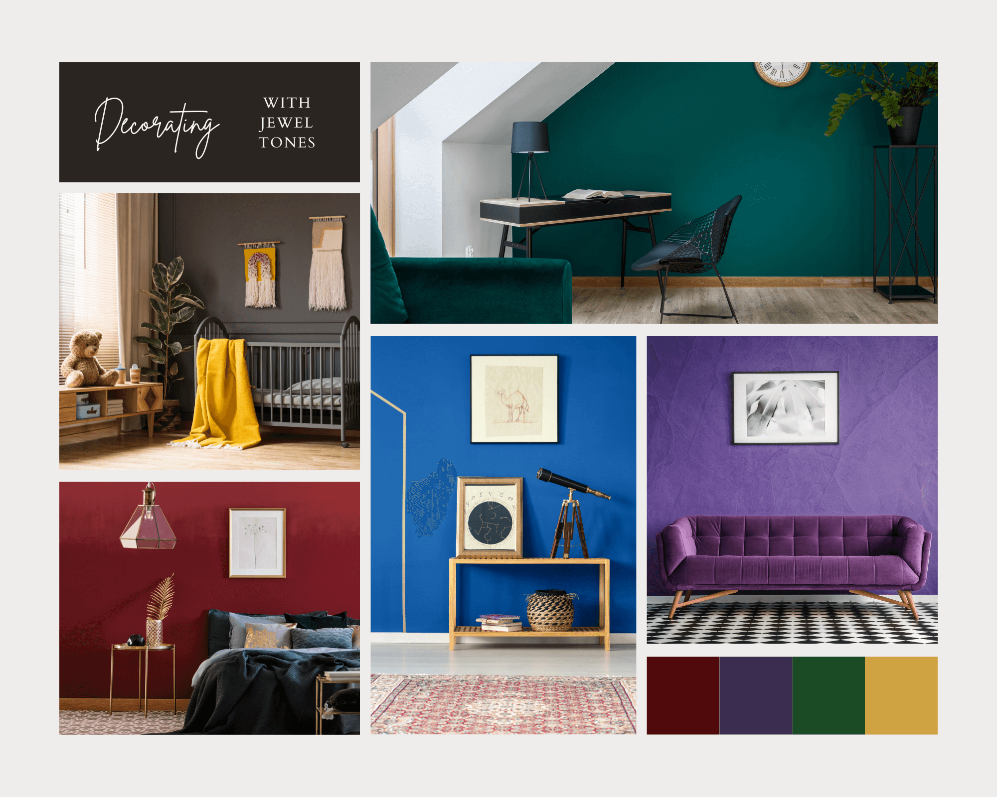
Follow the advice of the Gray Malin editorial team when choosing your jewel-toned color palette. In their article “Design Direction: How to Pull Off Jewel Tones,” the GM team notes that “when mixing multiple jewel-toned pieces together in one space, you’ll want to get acquainted with your classic color wheel first,” but using contrasting colors is not a must. Those decorating with jewel tones can create an “analogous color scheme,” which means “any three colors side-by-side on the tertiary color wheel.” Adding these in-between shades to your primary ruby reds or emerald greens will provide dimension and prevent the space from falling flat. Going “monochromatic with different shades of one jewel tone” can also work exceptionally well in interiors — particularly small single-use spaces like studies and home offices.
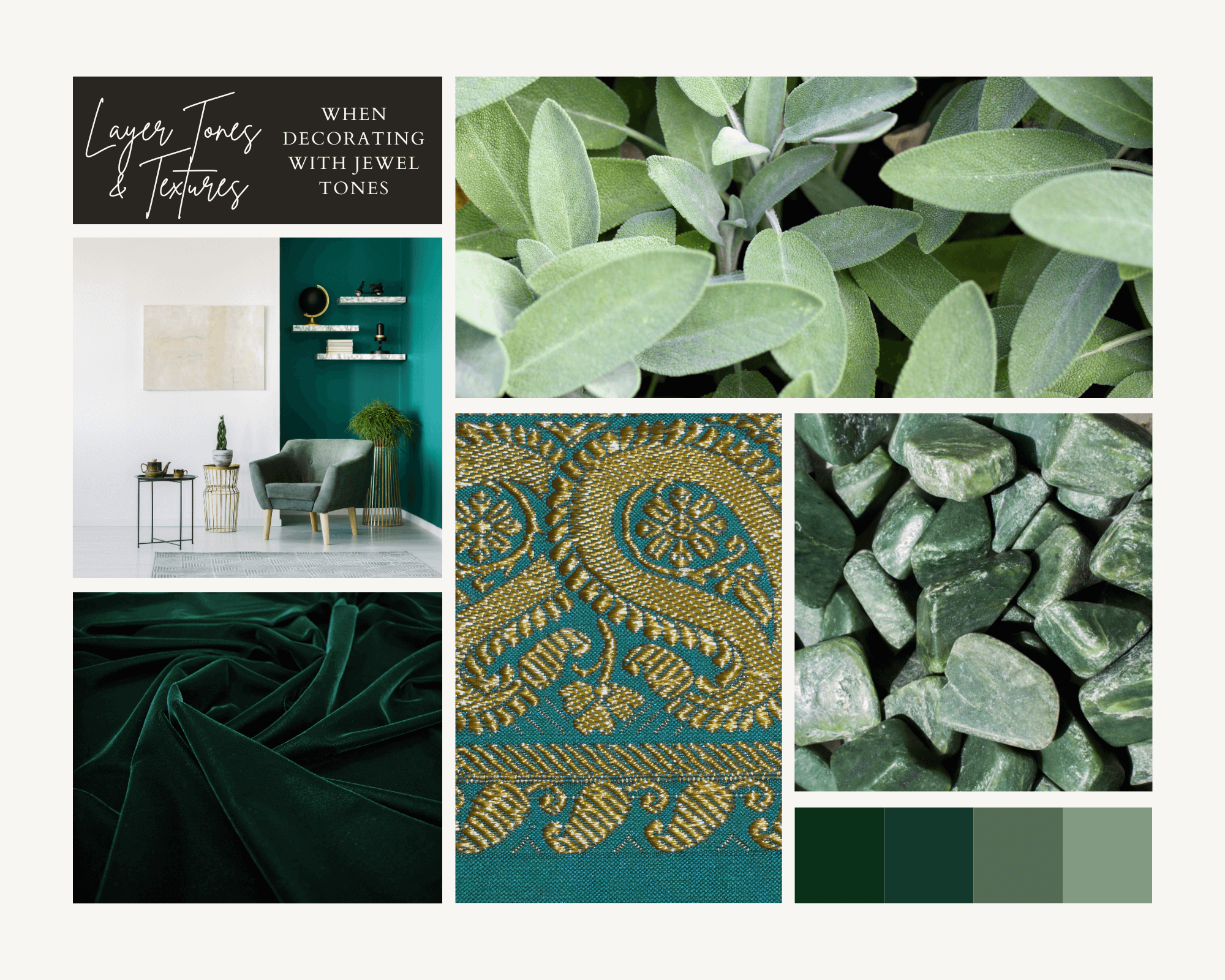
As explained in the Laura U Design Collective blog post “MAKE ANY ROOM LUXURIOUS WITH JUST ONE CHANGE: JEWEL TONES,” jewel tones “add richness, femininity, and an undeniable dose of glamour to any space.” While stunning as an accent wall, jewel tones accomplish so much more when varied textures and tones exist throughout the space. Layering bold tones with softer ones “carries the color palette through the design without it becoming overwhelming.” Consider complementing a rich turquoise with touches of mint or a deep emerald green with accents of sage. Including a variety of textures — velvet, brocade, linen, silk and more — in your jewel-toned interior creates more dynamism, engaging different senses and encouraging the eye to travel. Layering textures and tones allows one to “make a bold statement and dress the room from top to bottom in color” while maintaining a cohesive design and limiting visual noise.
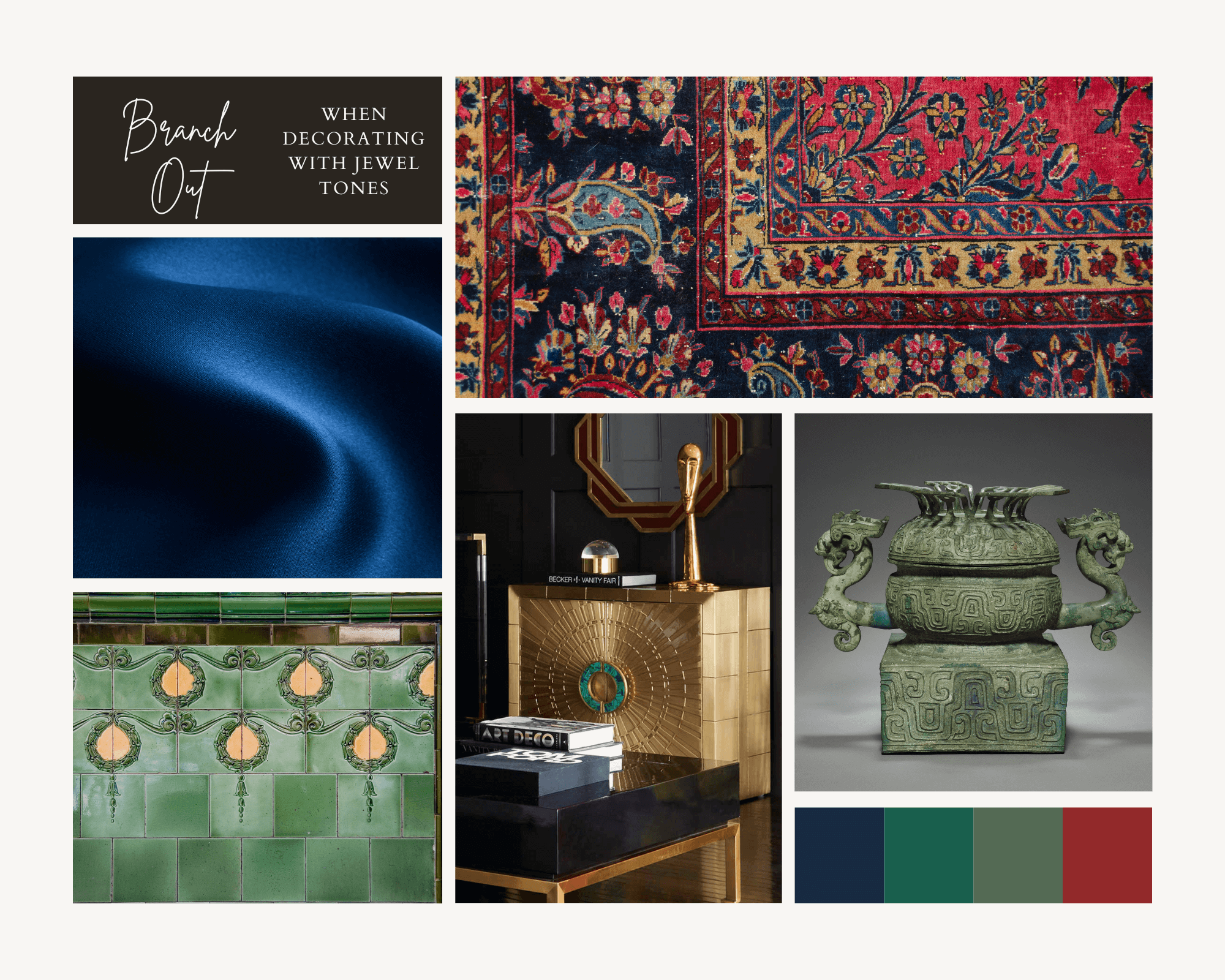
Of course, jewel tones often exist in textiles like the upholstery of chairs and sofas and the fabric of drapes and curtains. However, high-gloss tiles, lacquered cabinets and even light fixtures can also feature colors inspired by the stunning precious stones. In their article “Unlock Radiant Rooms With Jewel Tones,” vintage art and homeware resale platform Chairish explains the joys of decorating with jewel tones in unexpected ways. To spruce up a space that cannot handle oodles of decor objects, Chairish recommends retiling with “emerald or turquoise-colored tiles,” which the site notes “are perfect for punching up” a small bathroom or powder room.” Incorporating richly embroidered rugs with vintage flair or stone decor objects made from actual gemstones can add an authentic opulence to your space. We at TopModern recommend considering a jewel-toned wallpaper, pendant light fixture or series of drawer pulls to add interest.
For emerald and aquamarine jewel tones, we love Jonathan Adler’s Lampert Venice Emerald Sofa Couch with its rich upholstery and vintage silhouette. For a more muted color palette with jewel undertones, we recommend York Wallcoverings’ Modern Heritage 125th Anniversary Blue / Green Yarrow Nouveau Wallpaper. To create an accent wall reminiscent of a 19th century Italian giardini botanici or British sun room, we recommend York Wallcoverings’ Conservatory Green Botanical Damask Wallpaper. If a small jewel toned accent is desired — rather than a large swath of saturated color — we love Jonathan Adler’s Talitha Brass Accent Chest. The Art Deco-esque chest offers buyers natural malachite inlaid handles with stunning blue-green marbling and an emerald green satin interior. View the Talitha Chest in the collage for Tip #3.
Our favorite amethyst purple piece from TopModern is the Urbia Channeled Accent Chair in Plum Purple. For a softer lilac to accompany the Urbia chair, we suggest the Louis Poulsen Ph Grey 6'' Wide LED Mini Pendant with its tiers of pastel shades. A touch of citrine can be added to any interior with the classic Grasshopper floor lamp in Aspen Yellow. Deep lapis blue emerges in the Sunpan Modern Home 5west Metropolis Blue / Brown Accent Chair while lighter, brighter sapphire can be found in Jonathan Adler’s quirky Globo White / Blue 50'' Wide Rectangular Console Table. Lastly, a touch of ruby red finds its way home in ION Design’s Red Wine / Natural Walnut Sofa. For more of our favorite jewel toned homeware products from TopModern, view the collages below!

(From the Upper Left to Lower Left) Fontana Arte Cheshire Green Table Lamp, Sunpan Modern Home 5west Moss Green / Black Sofa Couch, Nuevo Vanessa Matte Emerald Green / Black Accent Chair, Jonathan Adler Lampert Venice Emerald Sofa Couch and York Wallcoverings Conservatory Green Botanical Damask Wallpaper
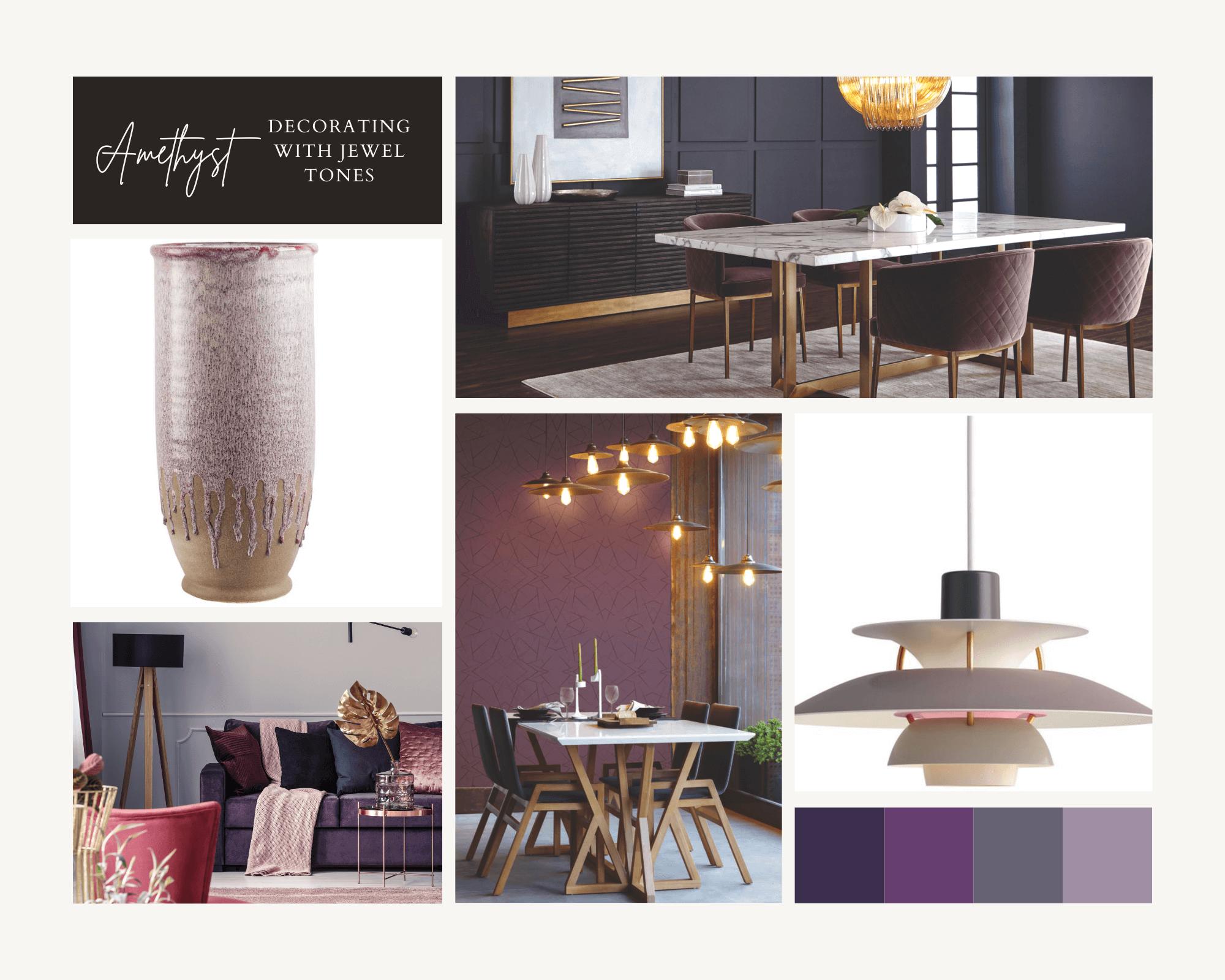
(From the Upper Left to Lower Left) Moe's Home Collection Caldera Purple Vase, Sunpan Modern Home Mixt Blush Purple / Antique Brass Arm Dining Chair, Louis Poulsen Ph Grey 6'' Wide LED Mini Pendants and York Wallcoverings Modern Art Purple Geo Diamond Wallpaper
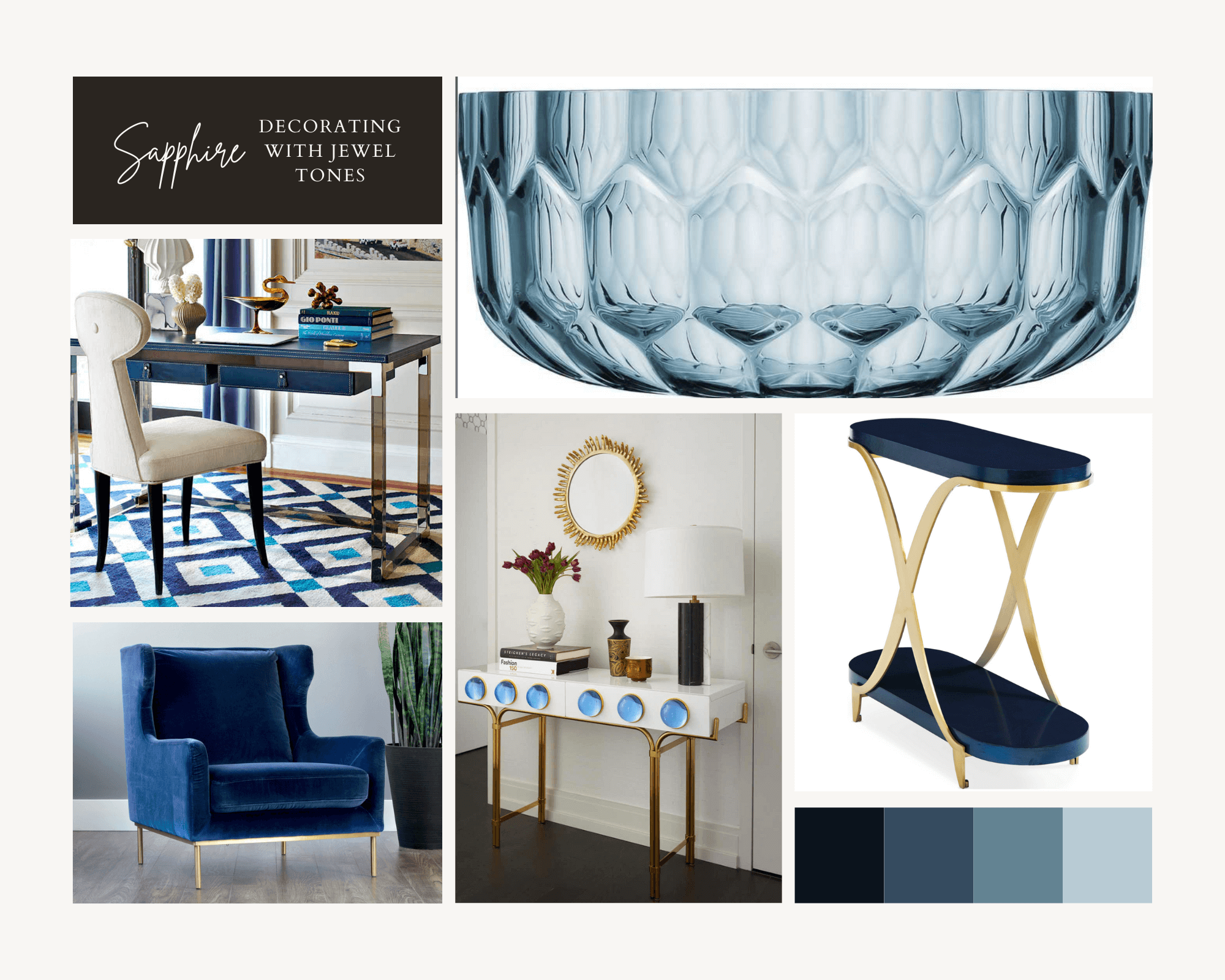
(From the Upper Left to Lower Left) Jonathan Adler Jacques Navy / Smoke Secretary Desk, Kartell Jellies Light Blue Basket, Caracole Classic 25'' Wide Oval End Table, Jonathan Adler Globo White / Blue 50'' Wide Rectangular Console Table and Sunpan Modern Home 5west Evening Navy / Antique Brass Accent Chair
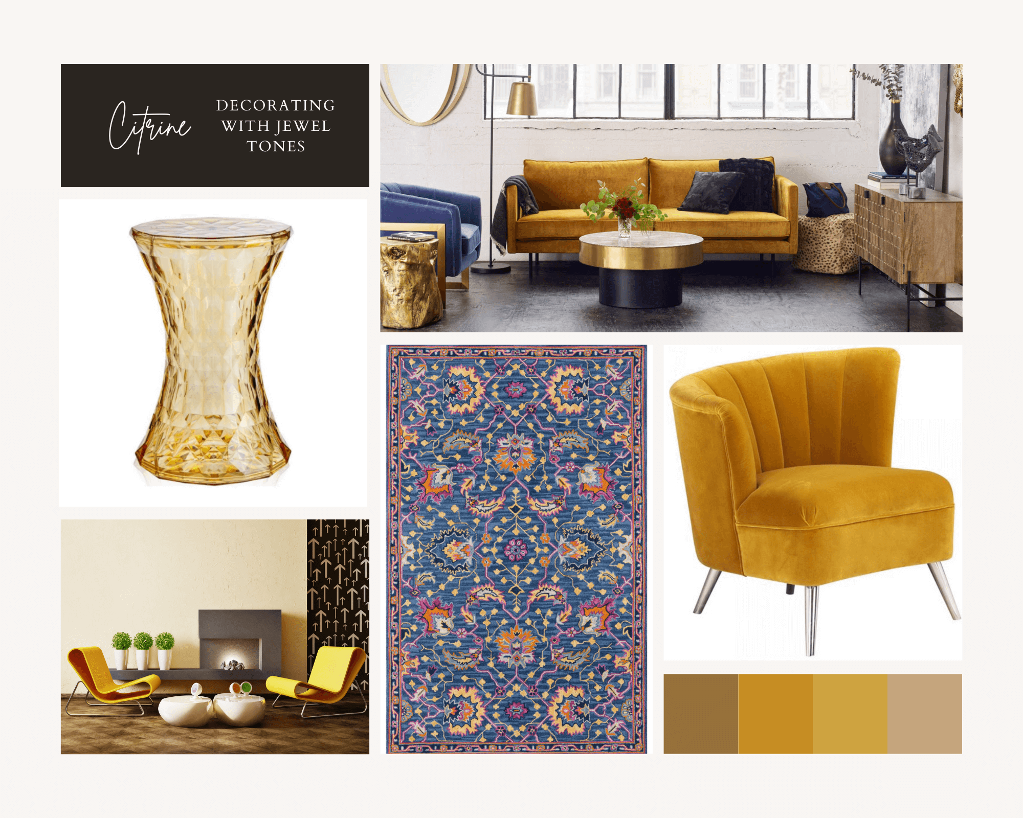
(From the Upper Left to Lower Left) Kartell Outdoor Stone Transparent Yellow Resin Dining Chair, Moe's Home Collection Raphael Yellow Sofa Couch, Moe's Home Collection Layan Yellow Accent Chair and Momeni Ibiza Blue Rectangular Area Rug
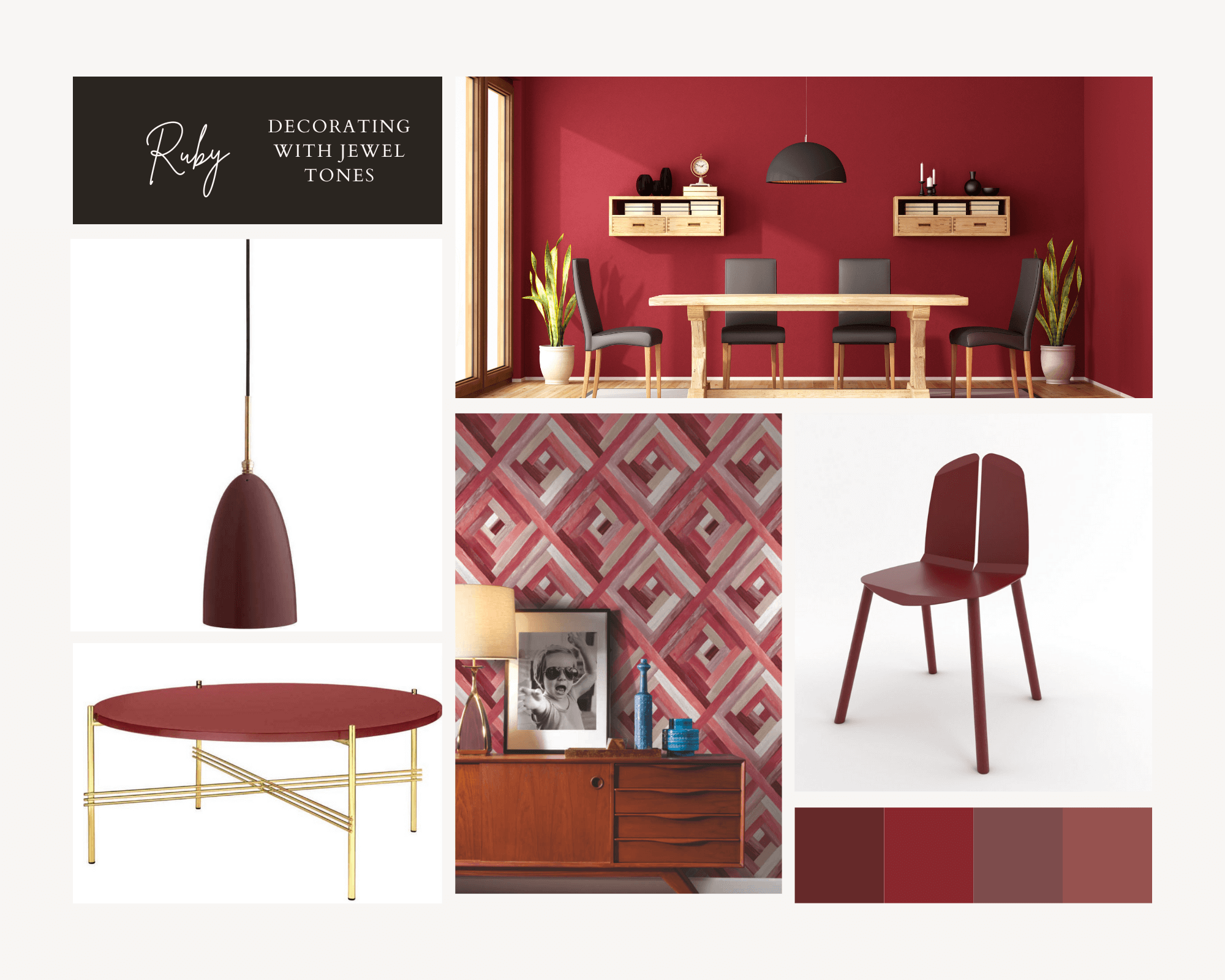
(From the Upper Left to Lower Left) Gubi Grashoppa Andorra Red Semi Matt 5'' Wide Mini Pendants, Tronk Design Blood Red Side Dining Chair, York Wallcoverings Modern Art Red Wynwood Geometric Wallpaper and Gubi Ts Rusty Red Glass / Brass 31'' Wide Round Coffee Table